How to Build a High-Converting Sales Page in WordPress Web Hosting Promo Codes
Building a successful online business often hinges on the ability to guide potential customers toward a single, decisive action. In the standard WordPress environment, visitors are frequently met with a barrage of navigation menus, sidebar widgets, and footer links that pull their attention in multiple directions. While these elements are helpful for general site navigation, they act as significant friction points when the primary goal is to sell a specific product or service. A dedicated sales page changes this dynamic entirely by stripping away these common distractions, creating a clean, focused environment where the visitor has only one path to follow.
By isolating your offer, you minimize the cognitive load placed on the user, allowing them to engage deeply with your value proposition without the temptation to wander elsewhere. This architectural shift is not merely about aesthetics; it is a strategic decision to prioritize conversion over general site exploration. When you remove the noise, you provide a clear, uninterrupted narrative that leads directly to your call to action. This guide explores the technical and strategic steps required to build these high-converting pages within WordPress, ensuring that every element on the screen serves a specific purpose in moving the visitor closer to a purchase. From selecting the right tools to fine-tuning your layout for mobile responsiveness, you will learn how to construct a professional, persuasive landing page that effectively communicates your value and drives measurable results for your business.
Why Dedicated Sales Pages Outperform Standard Pages
Standard WordPress pages often fail to convert because they are designed for exploration rather than action. A typical page includes a header menu, sidebar, and footer, all of which provide multiple exit points that distract visitors from the primary goal. When a user arrives at a page intended to sell a product, every link that leads away from the checkout process represents a potential lost sale.
A dedicated sales page functions as a distraction-free environment by stripping away these navigation elements. By removing the header, sidebar, and footer, the page forces the visitor to focus entirely on the offer. This structural choice ensures that the visitor’s attention remains anchored to the value proposition and the call to action.
Focusing on a single offer significantly improves conversion rates compared to multi-offer pages. When a page attempts to present several products or services, the cognitive load on the visitor increases, often leading to decision paralysis. A dedicated page streamlines this experience by presenting one clear story and one specific action, which is essential for guiding users through the decision-making process.
The fair caveat is that while removing navigation is effective for sales, it requires careful planning to ensure users can still find their way back to the main site if they choose not to purchase. I would be careful with removing all navigation without providing a clear, secondary exit path, such as a simple link back to the homepage in the footer, to maintain a positive user experience.
Strategic focus on a single conversion goal is the hallmark of high-performing sales pages. By eliminating unnecessary choices, you create a direct path that leads the visitor from interest to purchase without the friction of standard website navigation.
Beyond the immediate benefit of reduced exit points, dedicated sales pages allow for granular tracking of visitor behavior. By isolating the conversion path from the rest of your site, you gain clearer insights into where potential customers drop off. This data-driven approach enables precise adjustments to your copy or button placement, which is often difficult to isolate on a standard, multi-purpose page.
Furthermore, these pages serve as a controlled environment for testing. You can run A/B tests on specific headlines or layouts without affecting the user experience of your main website. This separation ensures that your primary site remains stable while you iterate on the sales funnel to maximize performance. The fair caveat is that managing a separate page requires consistent branding to ensure visitors feel they are still within a trusted ecosystem. I would be careful with design choices that deviate too far from your site’s core visual identity, as this can create a jarring transition that undermines the credibility you have worked to build.
- Isolate conversion paths to improve data accuracy.
- Enable A/B testing without impacting main site stability.
- Maintain brand consistency to preserve visitor trust.
- Simplify user choices to reduce decision paralysis.
The Anatomy of a High-Converting Sales Page
A successful sales page functions as a focused environment where every element serves the primary goal of conversion. By stripping away navigation menus and sidebars, you ensure that the visitor remains engaged with your offer from the first headline to the final call to action.
Crafting Clear Headlines and Value Propositions
Successful pages require clear, result-oriented headlines that immediately communicate the benefit of your offer. A headline should articulate the specific outcome a visitor can expect, such as mastering a skill or increasing revenue, within seconds of landing on the page. Avoid clever or vague phrasing that forces the reader to guess the purpose of the page; clarity is the primary driver of initial engagement. Directly beneath the headline, a strong value proposition explains exactly who the offer is for and why it matters, establishing relevance before the visitor decides to scroll further.
The Role of Social Proof and Testimonials
Social proof such as testimonials and star ratings builds necessary trust for first-time visitors who may be hesitant to commit to a purchase. By showcasing evidence that others have already achieved success with your product, you reduce the perceived risk of the transaction. Effective social proof focuses on specific, result-driven outcomes rather than generic praise, providing concrete evidence of value. Integrating these elements strategically throughout the page helps address lingering doubts and reinforces the credibility of your offer.
- Clear, result-oriented headlines to capture attention immediately.
- Concise value propositions that define the target audience and benefit.
- Specific, outcome-focused testimonials to establish credibility.
- Star ratings or client logos to provide visual trust signals.
- A single, obvious call to action to guide the final decision.
By balancing persuasive copy with these structural pillars, you create a cohesive narrative that guides the visitor toward a purchase. This framework ensures that your content is not only readable but also optimized for the specific goal of driving conversions.
Beyond structural basics, maintaining visual hierarchy is critical for guiding visitor attention toward your primary offer. By using contrasting colors for call-to-action buttons and ensuring generous whitespace around key benefits, you prevent the cognitive overload that often leads to page abandonment. Consistent branding across these elements reinforces professionalism, while strategic use of images breaks up dense text blocks to keep readers engaged throughout the narrative.
Effective sales pages also rely on a logical flow that anticipates user questions before they arise. By addressing potential objections through a well-structured FAQ section, you remove friction that might otherwise stall the conversion process. This proactive approach ensures that every visitor has the information necessary to make an informed decision without needing to navigate away from the page.
Installing and Configuring SeedProd
To build high-converting sales pages without writing code, SeedProd provides a drag-and-drop editor and a library of dedicated sales templates. This tool allows for rapid layout adjustments, which is essential for optimizing conversion rates. Before building, ensure the plugin is properly installed and licensed to access all premium features. SeedProd functions as a standalone framework, meaning it operates independently of your active WordPress theme to ensure layout consistency.
After installing and activating the plugin, you must verify your license to unlock advanced blocks and templates. License keys are managed via SeedProd » Settings in your WordPress dashboard. Simply paste your key into the designated field and click the verify button to finalize the setup. Proper verification is required to enable the full suite of conversion-focused tools, including dynamic product grids, countdown timers, and specialized WooCommerce blocks that are unavailable in the free version.
Once the license is active, the environment is ready for page creation. This foundation ensures that you have access to the necessary elements for building a distraction-free sales experience. By centralizing your license management within the plugin settings, SeedProd ensures that your site remains lightweight and focused on performance. If you encounter any issues during the verification process, ensure your server meets the minimum requirements for WordPress and that your API connection is not blocked by a firewall or security plugin. Taking these steps early prevents technical friction during the design phase, allowing you to focus entirely on crafting a compelling offer that resonates with your target audience.
Beyond basic activation, Isolation Mode serves as the primary diagnostic tool. This setting forces the plugin to ignore theme-level styling, effectively resetting the visual environment to a clean slate. This is particularly useful when your existing theme includes aggressive global styles that interfere with custom sales page layouts.
To ensure a successful setup, follow these essential configuration steps:
- Download the plugin file from the official SeedProd website or the WordPress repository.
- Upload and activate the plugin through the Plugins » Add New menu in your WordPress admin dashboard.
- Navigate to the SeedProd » Settings page to locate the license key input field.
- Paste your unique license key, which is available in your account dashboard or purchase confirmation email.
- Click the Verify Key button to confirm your subscription and unlock all premium features.
Note: If your site uses aggressive caching, you may need to clear your cache after verifying the license to ensure all premium blocks load correctly in the editor.
Creating and Customizing Your Sales Page
With the plugin activated, your next move is to open the SeedProd dashboard. From your WordPress dashboard, go to SeedProd » Landing Pages in the left-hand menu. To create a brand new page, click the ‘+ Add New Landing Page’ button. SeedProd will ask you to enter a Page Name and confirm its URL. I always give my pages a clear internal name like ‘Spring Course Sales Page’ so I can find them again easily later. As you type the name, the URL field will fill in automatically. You can always edit this link if you’d like to make it shorter or cleaner. Once you’re happy with both, click the ‘Next: Choose Template’ button to move on to the next step.
Selecting the Right Sales Template
Now comes one of my favorite parts, which is choosing a template. Rather than starting from scratch with a blank screen, SeedProd gives you a huge library of professionally designed templates that you can easily customize to fit your brand. To quickly find what you need, I recommend using the category filters. For example, clicking the Sales category instantly displays templates designed specifically for selling products or services. Each template is a complete starting point with a headline area, benefit sections, testimonial spots, and call-to-action buttons already in place. I usually pick a template that closely resembles my target design. If you prefer total creative freedom, you can select the Blank Template option to build your layout section-by-section. However, if this is your first sales page, starting with a pre-made design will save you a lot of time. To select a template, hover over its thumbnail and then click the checkmark icon when it appears. SeedProd will then load your chosen design into the editor, which is where the real fun begins.
Customizing Layouts for Brand Alignment
Let’s take a moment to explore the SeedProd interface. In the left-hand panel, you’ll find all the blocks and sections you can drag onto your page, while the center area displays a real-time preview of your site. It’s best to start with the main headline, since it’s the very first thing your visitors will see. To edit any text block, simply click on it in the live preview, and the customization options will automatically open in the left-hand panel. As you type, focus on highlighting the exact result your visitor is looking for. Instead of a vague headline like ‘My Online Course’, try something clear and actionable like ‘Learn to Bake Sourdough at Home in 30 Days.’ Using the left-hand sidebar, you can also easily adjust the font, size, and color to match your brand style. Making your main headline large and bold ensures it grabs attention the moment the page loads. Consistency in design across your page reinforces your brand identity and helps maintain visitor trust throughout the conversion process.
Note: Always verify that your chosen template’s mobile responsiveness remains intact after making significant layout changes, as custom adjustments can sometimes affect how elements stack on smaller screens.
Once the template loads, you should immediately evaluate the existing visual hierarchy. A well-structured sales page guides the eye from the primary headline to the supporting benefits, and finally to the call-to-action button. If the template’s default layout places the primary button below the fold, consider moving it higher to ensure it is visible immediately upon page load. This adjustment can significantly impact conversion rates by reducing the effort required for a visitor to initiate a purchase.
When customizing the layout, prioritize brand alignment by ensuring your color palette and typography match your existing site assets. You can modify these global settings within the SeedProd editor to maintain a cohesive look. Avoid adding too many decorative elements, as these can distract from your core message. Instead, focus on using white space to separate distinct sections, which helps improve readability and keeps the visitor’s attention focused on your offer.
If you find that a template includes sections you do not need, do not hesitate to delete them. A leaner page that focuses on a single, clear offer often performs better than one cluttered with unnecessary information. You can always add more blocks later if your testing indicates that visitors require additional details to make a decision. Remember that every element on the page should serve a specific purpose in moving the visitor toward the final conversion goal.
Building Persuasive Content and Visuals
Transforming a visitor into a buyer requires more than just a clean layout; it demands content that speaks directly to their needs. By focusing on real-world outcomes rather than just listing product features, you help visitors visualize the value of your offer. Every sentence should serve a purpose, guiding the reader toward the final decision to purchase. Avoid jargon that might confuse a first-time visitor, as clarity is the foundation of trust.
Key considerations for Building Persuasive Content and Visuals
When drafting your copy, prioritize the benefits that solve specific visitor problems. For instance, instead of detailing technical specifications, explain how those features save time or increase revenue. Breaking text with images prevents reader fatigue, keeping the visitor engaged as they scroll through your pitch. Use high-quality visuals to reinforce your claims, ensuring each image supports the narrative rather than acting as a distraction. Consistency in your messaging is equally important. Ensure that your tone remains professional yet accessible, mirroring the language your target audience uses. If your product is designed to simplify a complex workflow, your copy should reflect that simplicity.
Practical checks for Building Persuasive Content and Visuals
Before finalizing your page, review your content for flow and impact. Ensure that every section has a clear logical progression, moving from the initial hook to the final call to action. Check that your images are optimized for fast loading, as slow-loading media can drive visitors away before they see your offer. Regularly test your layout on different devices to confirm that your visual hierarchy remains intact across various screen sizes. Finally, verify that your benefit-driven copy is supported by concrete examples. If you claim a product saves time, provide a brief, relatable scenario that illustrates this. This approach bridges the gap between a promise and a proven result, making your offer significantly more compelling to a skeptical audience.
Beyond the initial structure, consider the psychological impact of your layout. Visual hierarchy dictates where a visitor looks first, so place your most compelling benefit near the top of the page. Use contrasting colors for your primary call-to-action buttons to ensure they stand out against the background, as this simple design choice often correlates with higher click-through rates. Avoid cluttering the page with excessive links or secondary information that might pull the visitor away from your main goal. When refining your content, keep the language active and direct. Address the visitor as ‘you’ to create a personal connection, and frame your sentences to emphasize the immediate relief or gain they will experience. If your product addresses a specific pain point, acknowledge that challenge early to build empathy before presenting your solution as the logical next step. This narrative arc helps maintain interest throughout the entire page.
- Use bold headings to break up long paragraphs.
- Keep sentences concise to improve readability.
- Ensure all images have descriptive alt text for accessibility.
- Limit the use of complex jargon to maintain clarity.
- Group related benefits together to simplify the decision-making process.
Optimizing Calls to Action and Checkout
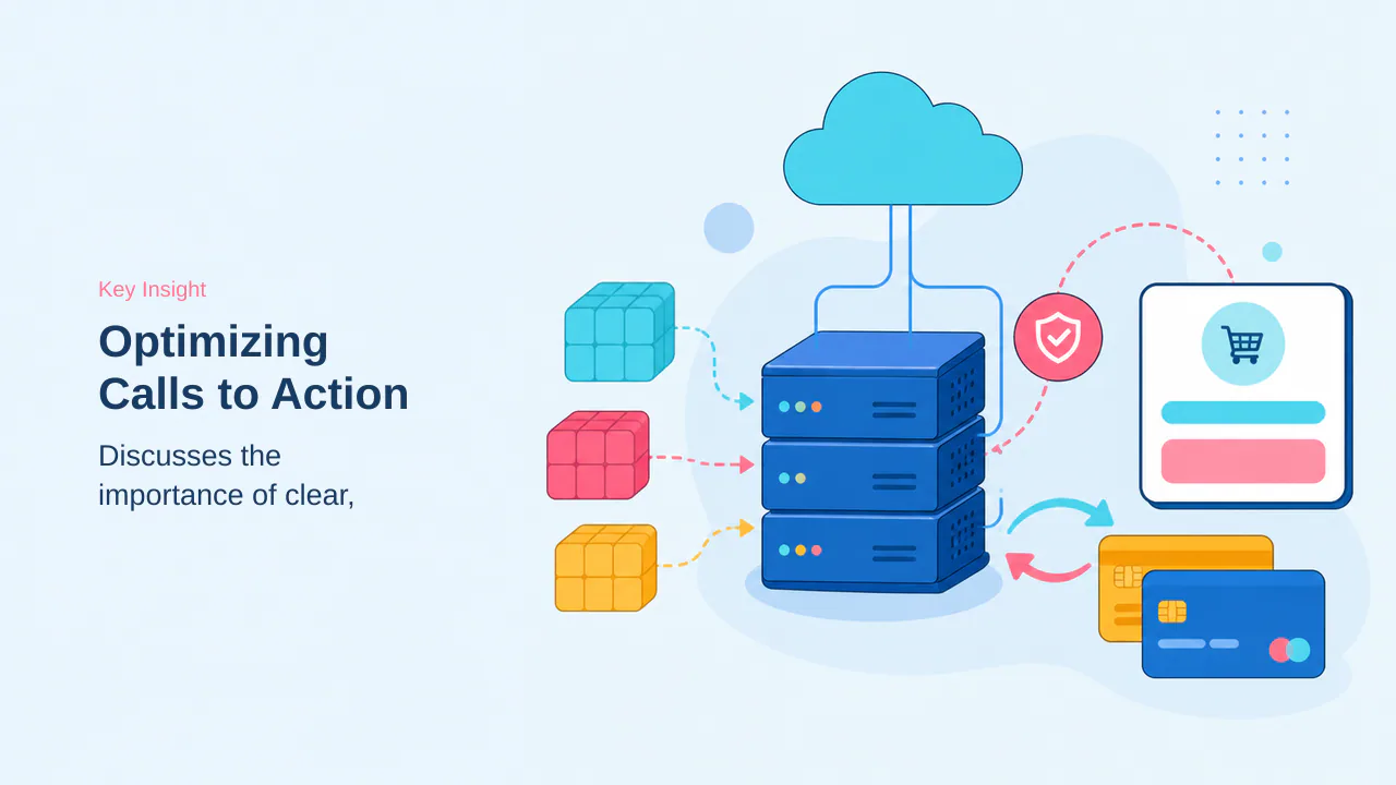
A high-converting sales page relies on a clear, frictionless path to purchase. Once a visitor decides to buy, every additional click or confusing form field increases the risk of abandonment. Your call-to-action (CTA) button serves as the final bridge between interest and revenue, so it must be both prominent and unambiguous.
Directing Traffic to Checkout
When designing your CTA, use direct, action-focused wording such as “Enroll Now” or “Get Instant Access” to eliminate guesswork. If you operate a WooCommerce store, you can link buttons directly to product pages or utilize dedicated checkout blocks to allow customers to initiate payment without leaving your sales page. For simpler digital products, linking to a secure payment form via Stripe or PayPal often provides a faster, more streamlined experience.
- Place CTA buttons in high-visibility areas, such as directly below your value proposition and at the bottom of the page.
- Use high-contrast colors for buttons to ensure they stand out against your page background.
- Keep button text concise; avoid generic labels like “Submit” or “Click Here.”
- Ensure the destination URL matches the specific offer described on the page.
Testing Links to Prevent Lost Sales
Technical errors in your checkout flow are silent revenue killers. Testing the checkout link is critical to avoid lost revenue, as broken paths often go unnoticed until a customer reports an issue. Always perform a live test purchase after publishing your page to verify that the entire transaction process functions as intended.
Note: Always test your call-to-action button after publishing your page. Taking a few seconds to click through ensures your link works properly and prevents lost sales.
Beyond the initial button placement, consider the checkout experience as a continuation of your sales narrative. If your checkout flow requires excessive information, you risk losing the customer at the final hurdle. Whenever possible, use guest checkout options to remove the friction of account creation, which often serves as a significant barrier to conversion.
Furthermore, ensure your payment gateway is configured to handle mobile transactions. A large portion of traffic originates from mobile devices, and a checkout form that does not scale or function correctly on smaller screens will negate all the effort put into your sales copy. Regularly audit your checkout page to confirm that all fields are easily tappable and that the payment submission process remains intuitive.
- Minimize form fields to only essential information like email and payment details.
- Verify that your payment gateway displays security badges to reassure users during the final transaction.
- Enable auto-fill support for address and contact fields to speed up the checkout process.
- Confirm that your checkout page loads quickly, as slow performance is a primary driver of cart abandonment.
- Minimize form fields to only essential information like email and payment details.
- Verify that your payment gateway displays security badges to reassure users during the final transaction.
- Enable auto-fill support for address and contact fields to speed up the checkout process.
- Confirm that your checkout page loads quickly, as slow performance is a primary driver of cart abandonment.
To further reduce friction, enable guest checkout options to remove the requirement for account creation, which often serves as a significant barrier to conversion. Additionally, ensure your payment gateway is configured to handle mobile transactions, as a large portion of traffic originates from mobile devices. A checkout form that does not scale or function correctly on smaller screens will negate all the effort put into your sales copy.
- Minimize form fields to only essential information like email and payment details.
- Verify that your payment gateway displays security badges to reassure users during the final transaction.
- Enable auto-fill support for address and contact fields to speed up the checkout process.
- Confirm that your checkout page loads quickly, as slow performance is a primary driver of cart abandonment.
Integrating Email Marketing Services

Not every visitor will buy on their first visit, and that is completely normal. Capturing email addresses allows for follow-up with interested visitors who are not yet ready to purchase. This strategy helps turn cold leads into customers over time. By building an email list directly from your sales page, you create a reliable channel for nurturing relationships, sharing updates, and eventually converting those hesitant visitors into loyal buyers.
To connect your email provider to SeedProd, navigate to the Connect tab within the page builder. Here, you will find built-in integrations for popular services like Mailchimp, Constant Contact, ConvertKit, and AWeber. Connecting email services typically requires API keys or account authentication to ensure a secure link between your sales page and your email platform. This integration is designed to be straightforward, allowing you to focus on your content rather than complex technical configurations.
- Select your email service provider from the list of available integrations.
- Follow the on-screen prompts to authenticate your account securely.
- Enter your unique API key if required by your specific provider.
- Verify the connection to ensure new leads are captured correctly.
- Test the opt-in form to confirm data flows to your email list.
Once connected, any opt-in form on your sales page will automatically send new leads straight to your email list. This automated process ensures that you never miss an opportunity to nurture a potential customer, even if they do not complete a purchase immediately. Proper integration is essential for long-term audience growth and consistent follow-up efforts. When you automate this data transfer, you remove the manual burden of managing lead lists, allowing you to focus on crafting effective email sequences that provide real value to your subscribers.
Testing the integration after setup is a critical step to confirm that data flows correctly from your page to your email marketing service. I would be careful with assuming the connection is active without performing a live test; a simple submission of your own email address is the most reliable way to verify that the system is working as expected. If you have not yet selected an email platform, research the best WordPress email marketing services to find one that aligns with your business needs. The fair caveat is that while these integrations are powerful, they are only as effective as the email content you provide to your new leads. Ensure your welcome sequences are ready before you start driving traffic to your sales page, as the first interaction with a new subscriber often sets the tone for the entire relationship. By taking the time to verify these connections now, you prevent the frustration of lost leads and ensure your marketing efforts are fully supported by your technical infrastructure.
Configuring Settings and Publishing
Before launching your page, it is essential to review the behind-the-scenes settings that control how your page functions and appears to visitors. These final adjustments ensure that your sales page remains focused and professional, preventing common display issues that can distract potential customers.
Using Isolation Mode for Layout Consistency
If your finished page appears misaligned or displays incorrectly on your live site, the most effective solution is to enable Isolation Mode. This setting instructs SeedProd to ignore styling from your WordPress theme and other plugins, which is often the primary cause of layout conflicts. By activating this mode, you also intentionally hide your theme’s standard header and footer, which is critical for maintaining a distraction-free environment that keeps visitors focused entirely on your sales pitch.
To enable this, navigate to the Page Settings tab within the SeedProd editor and select the General section. In my experience, enabling Isolation Mode fixes common display issues instantly, making it a reliable first step if your page layout looks unexpected.
Mobile Preview and Performance Checks
Since a significant portion of web traffic originates from smartphones and tablets, mobile previewing is essential for ensuring readability on smaller screens. Skipping this step often leads to poor user experiences, such as text that is too small to read or buttons that are difficult to tap. To perform this check, select the Design tab and click the Mobile Preview icon in the bottom toolbar. Verify that your headline, body text, and call-to-action buttons render clearly and maintain their logical flow on mobile devices.
Once you are satisfied with the mobile layout, click the dropdown arrow next to the Save button and select Publish to make your page live. If the page does not appear immediately after publishing, it is likely due to a caching plugin displaying a previously saved version. You can usually solve this by clearing your cache, which forces the server to serve the updated page content to your visitors.
Post-launch, monitor performance metrics to identify potential bottlenecks. If conversion rates remain lower than expected, review the page heatmaps to determine if visitors are abandoning the page before reaching the primary call-to-action. Adjusting the placement of social proof or clarifying the value proposition often yields immediate improvements in engagement.
Should you encounter persistent display issues after clearing your cache, verify that no conflicting scripts are being injected by third-party analytics or marketing tools. Disabling these temporarily can isolate the source of the conflict. Additionally, ensure your SSL certificate is correctly configured, as insecure connections may prevent payment gateways from loading, effectively breaking your checkout flow.
- Check browser console for JavaScript errors.
- Validate SSL certificate status for secure payment processing.
- Review page load times to ensure mobile performance remains optimal.
- Check browser console for JavaScript errors.
- Validate SSL certificate status for secure payment processing.
- Review page load times to ensure mobile performance remains optimal.
Beyond initial setup, ongoing maintenance ensures your sales page remains a reliable revenue driver. Regularly audit your page performance by checking load times, as slow-loading assets can increase bounce rates and negatively impact search engine rankings. If you notice a decline in engagement, consider A/B testing different headlines or button colors to determine which variations resonate most effectively with your audience. Keep your content current by updating testimonials or adjusting pricing tiers as your product evolves, ensuring the information remains accurate and persuasive for new visitors.
Security remains a critical component of your checkout flow. Periodically verify that your SSL certificate is active and correctly configured, as browser warnings regarding insecure connections will immediately deter potential customers from completing a purchase. Furthermore, ensure that any third-party marketing scripts or tracking pixels are optimized to load asynchronously, preventing them from blocking the primary page content during the initial render. Maintaining a clean, fast, and secure environment is the most effective way to protect your conversion funnel over the long term.
- Audit page load speeds to minimize bounce rates.
- A/B test headlines and CTA buttons to optimize engagement.
- Update testimonials and pricing to reflect current offerings.
- Ensure SSL certificates are active to maintain checkout trust.
- Optimize third-party scripts to prevent rendering delays.
Creating a high-converting sales page is an iterative process that balances psychological persuasion with technical precision. By removing standard site navigation and focusing the visitor’s attention on a single, well-defined offer, you significantly reduce the friction that often leads to cart abandonment. The effectiveness of your page relies on the clarity of your value proposition, the strength of your social proof, and the seamless functionality of your checkout and lead capture systems. Each element, from the headline to the final call to action, must work in harmony to guide the user toward a purchase decision. I would be careful with the assumption that a page is finished once it is published; the fair caveat is that consistent testing and refinement are necessary to maintain performance over time.
Technical configurations like Isolation Mode and mobile optimization are not optional; they are foundational requirements for ensuring that your message is delivered clearly across all devices. If you encounter display issues or broken links, these are often signs that the page needs a quick audit of its settings or a refresh of the site cache. Integrating email marketing services further extends the value of your sales page by providing a safety net for visitors who are interested but not yet ready to commit. This multi-layered approach ensures that you are not just capturing immediate sales, but also building a pipeline of potential customers for future engagement. That does not make it bad, but relying solely on a single page without considering the broader user journey can limit your long-term growth. By maintaining a disciplined focus on the user experience and regularly reviewing your conversion metrics, you can create a sustainable engine for sales that grows alongside your business. The goal is to provide a clear, professional, and persuasive experience that earns the trust of your visitors, turning casual traffic into a consistent stream of conversions.